10.07.2023
HAMMER'S EXPANSION PUNCTURES MYTH OF ‘FLEXIBLE’ MUSEUM SPACE
A smart expansion at the Hammer
by Carolina Miranda
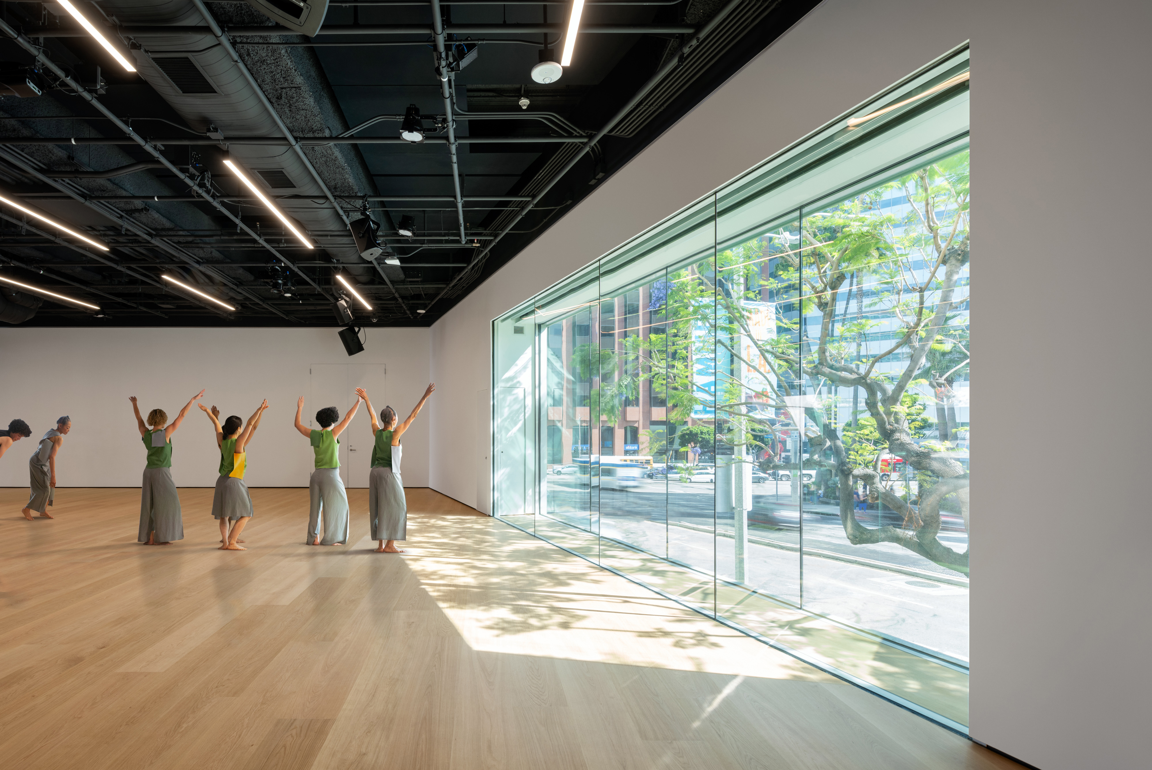
It’s a big week at the Hammer Museum: The sixth edition of the splashy “Made in L.A.” biennial has landed and it’s the first to be staged since the museum completed a two-decade, $90-million renovation and expansion that, over time, has added galleries at different scales, a state-of-the-art drawing center, a refreshed courtyard and renewed back-of-house spaces. (My colleague Deborah Vankin wrote about the revamp when it opened in March.) A particularly elegant touch: the staircase that zigzags dramatically between the museum’s administrative floors.
The expansion, part of an evolving master plan devised by Michael Maltzan Architecture in the early 2000s with the museum’s director, Ann Philbin, has been about taking a scalpel to a structure that, since the beginning, has felt more like a Late Modern bunker than a public museum. The original building, designed by Edward Larabee Barnes, was essentially a horizontal box banded in black and white marble, attached to the base of the old Occidental Petroleum Tower (now owned by UCLA)
Upon its debut in 1990, Times art critic William Wilson described it as “too aggressive.” It was certainly off-putting — giving little more than blank façades to the city around it. Over the years, Maltzan says he’s encountered people who thought it was the parking garage for the tower. “There was no sense that the museum was here.”
Over the last two decades, Maltzan’s firm has skillfully sculpted this ungainly complex.
Entrances have been made more prominent and gallery ceilings raised. A dull auditorium was transformed into the more welcoming (and lightly glamorous) Billy Wilder Theater. An unfinished black-box space next to the theater was turned into a studio/lecture/performance space and windows were added to admit daylight. A bridge added to the second level in 2014 better connected galleries on one side of an outdoor courtyard to galleries on the other. (I like to call it the bridge of tears of L.A. Times employees, since it was funded, in part, by our disastrous former owner Sam Zell.)
A more recent addition has been a fantastic 3,100-square-foot gallery devoted to works on paper on the third floor, which opened last year. And this spring, the museum opened a highly idiosyncratic exhibition hall for contemporary art: an old bank space on the eastern end of the building that remains in a very raw state. The vault is still visible, the floors are a rough combination of concrete and terrazzo and patches of the drop ceiling are missing. Reaching it requires a circuitous route: either out onto Wilshire or via an elevator that deposits you into the very corporate lobby of the Occidental tower and on to the bank space beyond.
Finding the gallery is akin to locating a speakeasy — and the current installation, by Rita McBride, a series of neon green lasers and and puffs of mist, makes it feel as if you’ve wandered into some secret lab.
I am into the variety. But it is the works-on-paper gallery, above all, that has seduced me since it opened last year.
Diminutive cut-paper pieces by Picasso and studies by op-art painter Bridget Riley, which might have been swallowed up by a room at any other scale, popped with a sense of immediacy in recent shows. Currently occupying the gallery is an ongoing exhibition of work by Van Leo, a dashing Armenian Egyptian studio photographer who first rose to prominence in the 1940s. One display area is covered in wallpaper inspired by the decor of a Cairo home that was formative to Leo as a young man. The gallery is an institutional space that, because of its human scale, can also feel personal.
The Hammer’s mix of exhibition spaces has lately had me reflecting on the nature of museum galleries.
One of the buzz phrases in museum architecture in recent years has been “flexible space.” Often, this has translated to cavernous galleries divvied up by temporary display walls. Except those temporary walls end up becoming semipermanent, because temporary walls in Southern California have to be engineered to seismic code — which makes them onerous to install.
It would explain why purportedly “flexible” galleries at museums like the Broad and the Los Angeles County Museum of Art (specifically the Resnick Pavilion) have had an unchanging layout for years. The Orange County Museum of Art, which opened late last year, has a similar type of space. And I’m willing to put money down on the fact that the “temporary” walls in their “flexible” gallery space will not be rearranged anytime soon.
This phenomenon has led to a whole lot of sameness across museum design — an aesthetic with a whiff of art fair. It also doesn’t do any favors to the art. Small vintage photographs and tiny drawings simply get lost in a room with 20-foot ceilings. “Bigness,” says Maltzan, “is different from flexibility.”
The Hammer has done it right, developing a series of singular spaces that provide experiences geared to specific types of art. Moreover, the plan has found ways to adapt an old building to new uses.
One of the installations I relished in the current biennial was by the Los Angeles Contemporary Archive (which Vankin wrote about last week). The artists affiliated with the archive have turned a small room near the bank gallery in the petroleum tower lobby into an anodyne-looking employee break room, complete with industrial coffee maker. There is also a snack machine, though look closely and you’ll find that it is stocked with art. Tucked into some of the counters are additional displays.
It’s a case of prankish artists undermining the corporate aesthetic of the architecture — and the sort of conceptual piece that would get lost in a blank, “flexible” space.